OP Art Research
OP Art is a form of abstract art that uses repeated pattern and colours to create an optical illusion.
Bridget Riley
Riley was born in 1931 in London, Riley studied at Goldsmiths. In the 1960 Riley switched from landscapes to OP art.
I find this art piece quite interesting as it looks disjointed and confused but also has a uniformed look to it. The title ‘Nataraja’ means Lord of the Dance and Riley’s choice of some primary colours with different accents makes the picture look as if it is in constant motion.

Jim Lambie
Lambie was born in Glasgow,Scotland and graduated from Glasgow School of Art in 1994. He uses everyday material to produce his art. With the staircases he uses vinyl tape to emphasis the interior arcitecture of buildings giving the illusion of the floor space contracting or expanding.
Personally I think that the colours are too bright and using stairs for art is not something that interests me. 
Victor Vasarely
Vasarely is considered one of the earliest Op artists and is known as the grandfather of OP art.
I find his work interesting as he uses the same shape throughout this image but he distorts the circles as if they are wrapped around a sphere bulging out of the surface of the painting. The circles and the colours he has chosen give the piece an mesmorising visual appeal.

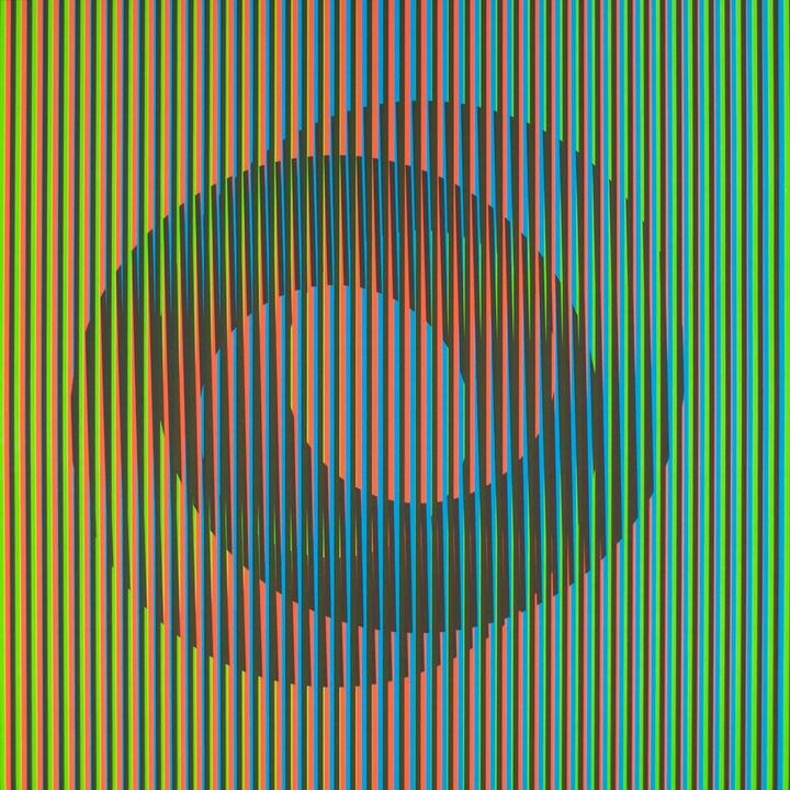
Carlos Cruz-Diez
Diez lives in Paris and has been creating Op art with his main focus of his work being the colours and how they are perceived.
“In my works, color appears and disappears during the course of a dialogue with real space and time. What also emerges is the undeniable fact that the information we have acquired and the knowledge we have memorized throughout our lifetime are, probably, not true… at least to some extent”.
What I find interesting with this piece is that it looks like it is being distorted by the lines of colour which make it pop out to me. You have to look really hard at the painting to determine where the circles are and are not. I also like the progression of colour from one side of the painting to the other.
Pop Art Research
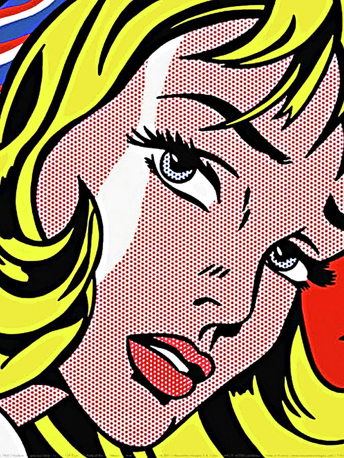
Roy Lichtenstein
Lichtenstein was born in October 1923 in New York, United States
Lichtenstein is an Pop Artist and is considered one of the most innovative artist of the twentieth century.
Lichtenstein learned from painting and drawing at the Art Students League of New York.
Find his art work to look very comic book like, with it